Spot That Winner In Seconds

Have you ever wondered what is the quickest and best way to spot a winner?
Have you ever wondered ho to get a read on the market and also know exactly which sectors are doing well and which ones are not?
Have you ever wanted to know how a sector was doing as a whole over different time periods and who are the best performers in that sector over that time period.
Heat maps gives that to you in seconds.
Worth A Thousand Words
Nothing offers you more information at a glance than these do.
They say a picture is worth a thousand words and heat maps may be worth many more. What a heat map offers you is a visual representation of the market and each sectors performance in one visual.
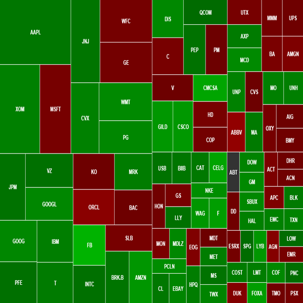
Here’s one of the Gold & Precious Metal Miners Companies involved in the gold and precious metal mining industries.
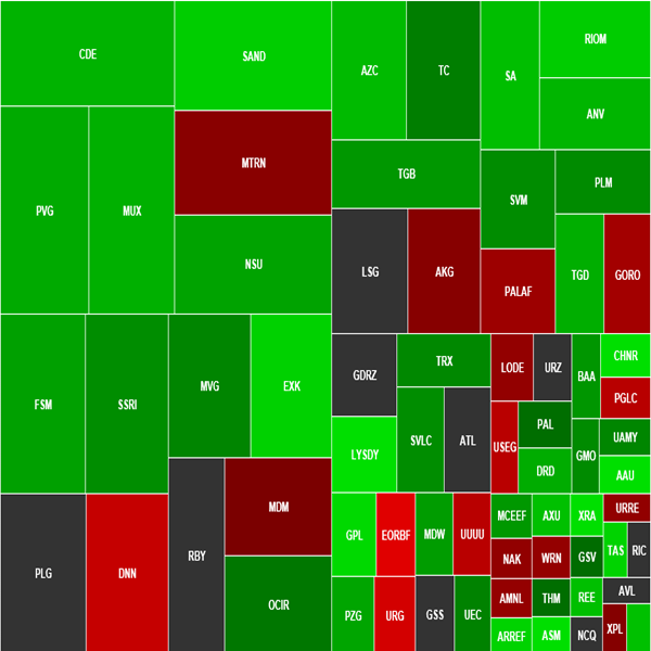
Sexy aren’t they? Well if you haven’t seen them before you may not agree and you may think they are actually confusing at first? But when I explain them a little more I’m sure you will agree with me.
Tell Me More About Heat Maps?
How a heat map works is it shows you through color what is happening throughout the market with green representing increasing prices and red representing declining prices.
They offer much more depth than even that by showing different shades of red and green with the brighter the green representing the more positive the price increase and the brighter the red representing the greater the decline.
You will see from the screenshot below that NEM stock is the brightest green on the map representing the greatest price increase (based on percentage) compared to the others.
NEM is the best performer here
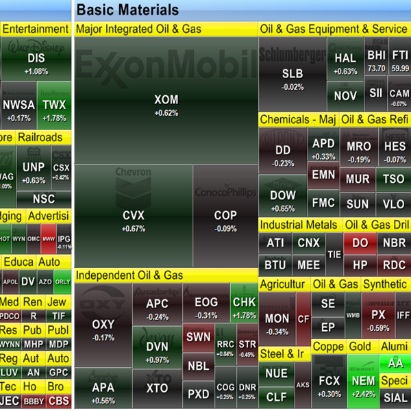
You will see from the screenshot below that ORCL stock is one of the brightest reds on the map representing the greatest price decline (based on percentage) compared to the others.
ORCL is the biggest decliner here
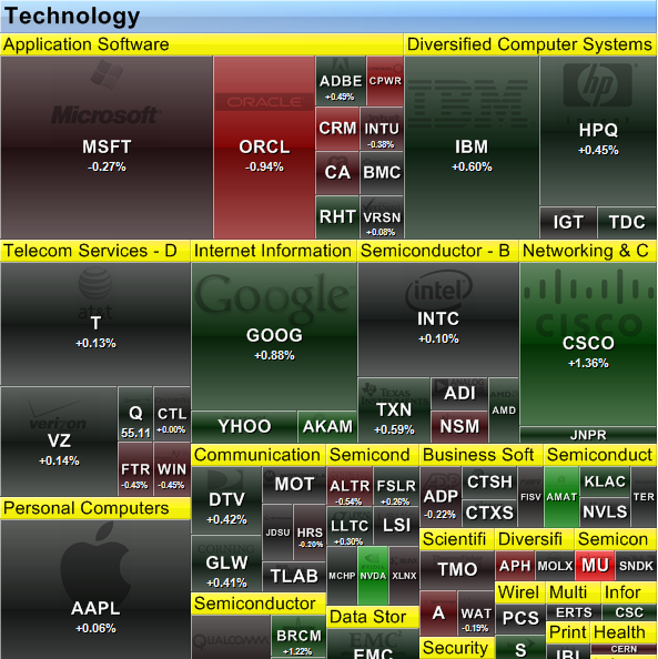
The fun doesn’t stop there as we can choose different timeframes such as daily, weekly, monthly, quarterly and even yearly.
This is important because it’s great to go back 6 months and see what that sector looked like compared to 1 month ago and get a general sense of the trend and strength of it.
You can also view maps of EPS (very cool), World Markets as a whole, ETF’s, Mutual Funds, Growth Funds, etc.
Here Are 2 Of My Favorite Places For Heat Maps
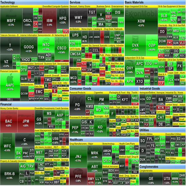
FINVIZ
You can find it here.
Here’s A Screenshot Of It
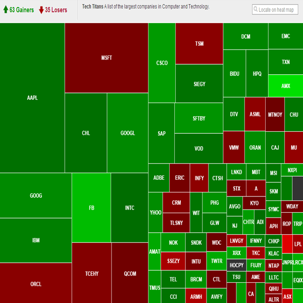
ShareBuilder
You can find it here.
https://research.sharebuilder.com/sharebuilder/stock-market/heatmap
Here’s A Screenshot Of It
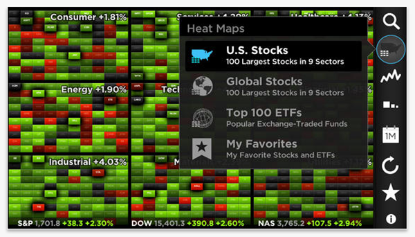
Here’s a great app for your phone that allows you to view heat maps.
Stock Touch

Here’s A Screenshot Of The App
Let me know if you like them and I will go into more depth on how to use them in your trading and investing so as to benefit from them.
Now go and start using them and have some fun.
As always we would love to hear from you, so please comment below.
Remember to tell your friends about this page if you found it useful.
